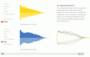
Our Aging Population
Another very nice piece of work visualising data.

Visualizing.org is displaying some animated age-pyramids that tell a unique story of the challenges of growth in the coming decades.
From the site:
On October 31, 2011, demographers at the United Nations reported that the earth’s population had reached 7 billion. That number marks an increase of 1 billion in a single decade, and is projected to approach 9 billion by 2050. Data visualization can help us understand the evolving demographic composition of the world population, the economic implications of such growth, and the challenges we must overcome to accommodate a global community of 7 billion with Earth’s limited natural resources.
We know that the long term trend for TOTAL global population is slowing and will plateau, somewhere in the range of 7.5 and 10.5 billion by 2050. We also know that most of the rapid growth and the families with 4-5 + children per family are in sub-Saharan Africa, whilst many other modern economies are at or below replacement-rates for their populations. So while the overall global trend is positive, regionally, the variations are huge.
The impact for resource use, resource allocation and global co-operation remain profound.
Links:


