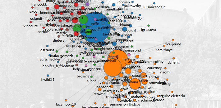
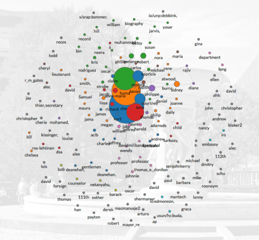
What an inner-circle really looks like!

The MIT Media Lab Macro Connections group, has done some stella work on visualising network associations over their time. You should visit the Global Language Network or the Human Development Index Tree [2010] They build tools to transform data into stories.
The Clinton Circle, maps emails from Hillary Clinton, John Podesta and the DNC in the United States.. Certainly topical!
The data is entirely sourced from WikiLeaks, and was last updated on Sun Oct 30, 2016.
People-centric view of email
ClintonCircle was not created to visualize these emails, but it is a fork of a tool called Immersion that they launched in 2013 that helps people visualize and understand the networks they weave through email interactions. They say:
Immersion is an invitation to dive into the history of your email life in a platform that offers you the safety of knowing that you can always delete your data.

Macro-Connections study collective learning at @MIT@medialab by looking at the evolution of what people make, and by making tools to improve how they communicate.
Seems like a class I would have loved!


